
OpalAR
An Augmented Reality (AR) experience where you can view the Sydney Rail Network with an Opal card (Sydney's public transport card).
Service
Client
Augmented Reality
UX/UI Design
Personal Project
Year
2019

Want a quick glance of a transport map but there's none around? 🚃
Being new to Sydney, I find myself confused about which train line to take and there's a lack of train maps around the stations.
So I thought: Since people often travel with their travel card ready in hand, it would be cool and convenient to be able to see a train map directly from your card.

Viral on LinkedIn and social media
Over half a million views and 20k of interactions including likes and shares.
What happened next?
Featured on
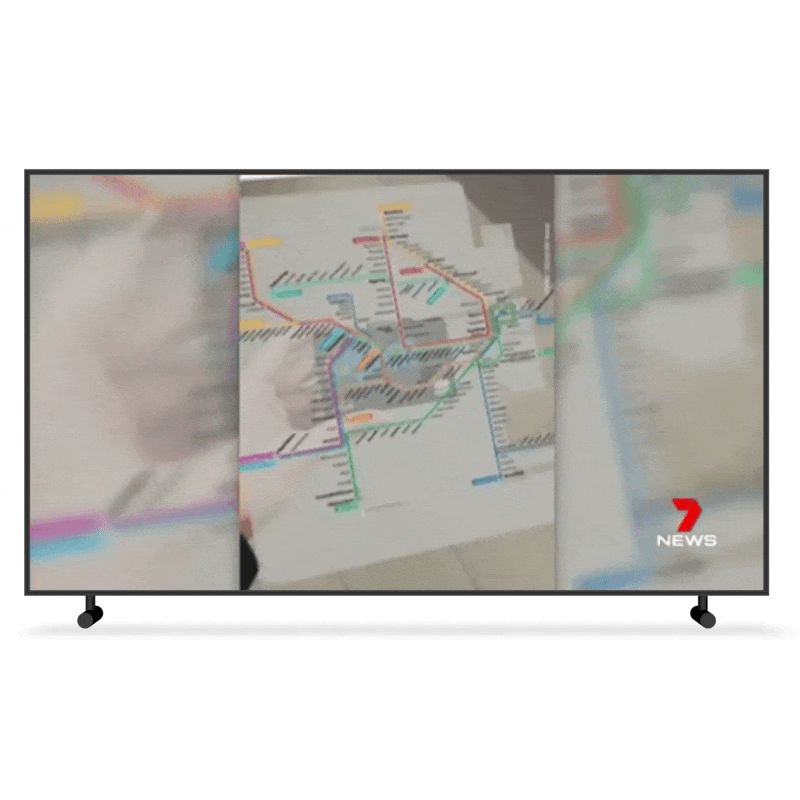
TV news
7NEWS Sydney featured it in their evening TV segment on the 27th June 2019.

Presented at events
Had demonstrations of the AR experience and technology at events such as Women in AR/VR at Facebook and private meetings.
Started out as a side project, I developed it in AR and decided to post a video of it on my Linkedin. Within a few days, it blew up unexpectedly.
News Feature
Credits to 7NEWS Australia
Why Augmented Reality?
I developed this with Facebook's AR development platform. Here are some added benefits:
1. The AR can be triggered by Facebook or Instagram app's camera with a link, there's no need to download an app just for it.
2. Most people have the standard adult opal card, AR-compatible smartphones and the required apps installed in their phones, so the AR experience is accessible to a wide range of people.
AR UI Interface
The train map belongs to Transport NSW. To adapt the map into an AR experience, I simplified the design and leaned heavily on colours to differentiate the train lines. In the AR view, there would be the camera feed as the background, so I placed a white background as a base for each asset to make the information clearer for the user.

Landing Page and Branding
Inspired by Massimo Vignelli's iconic design of NYC's subway maps and Sydney's train lines' colours, I went with a bold branding which consists of large texts, colourful distinct colours and simplicity to make public transportation an enjoyable and accessible experience.
I also created a landing page for the product to gather interest from the public.

Presenting the project
I also got to speak in a panel at Women in AR/VR at Facebook Sydney and demo my project to industry leaders which was awesome!


